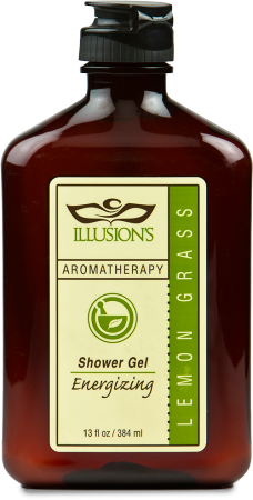
Matte Laminate
For a soft/smooth label to contrast the shine of the bottle.
Film material
To protect the label and print from being damaged or faded due to the shower.
3 color label
For an apothecary look.
Special Die-Cut
Give the label a distinguish and also allow for proper application
Fine Text
Small printed clearly for important information to be legible by consumer
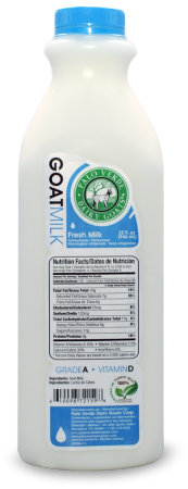
Film Materials
Will accommodate for cold temperature and condensation.
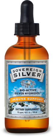
Special Foil Material
Dull silver foil material to complement product branding.
Four Color Process
Complex 4 color process image printed in high-res photo quality.
Spot PMS
Bold spot PMS color to emphasize products benefit.
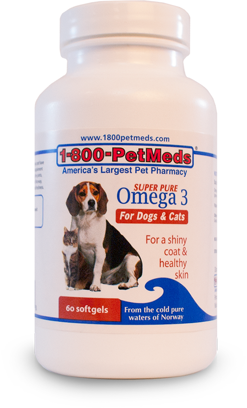
Spot PMS
2 spot PMS Colors to maintain brand consistency.
Four Color Process
High-Res 4 color process image printed in photo quality.
High Gloss Finish
UV coating which protects and gives a bright shine to the label.